
Piyaphon Inthavong (0337589)
Application Design 1
INSTRUCTIONS
LECTURES
Week 1 | April 16th, 2020
This is an introductory class to the Application Design 1 module. We had a quick brief about all the exercises and projects. Mr. Razif showed us a few examples of the proposal slides, the UI/UX documentation and explained the full process of creating an application. The process is described according to the module projects as the following:Project 1 is based on the ideation process of creating a custom application of our own. The process highlights the purpose of the app and market studies. It's essential to identify what's out there, the potential target audiences, and the features that help it stand out from its existing competitors.
Once the research is complete with a proposal, the second project is the documentation of UI/UX. It's time to narrow the research down into the visual aspects of the application. We'll have to consider the valid reasons for the application's color scheme and layout. We're also proceeding to the first step of creating a low-fidelity wireframe, which is the flow chart and user flow. Following the completion of the blueprints, the last few steps (Project 3 and the Final Project) is the production of the high-fidelity wireframe through software such as Adobe XD or Invision.
Week 2 | April 23rd, 2020
The main topic of lectures for today is User-Centered Design. User-centered design are involved in our daily interaction with the environment. It is the matter of asking "how does it make you feel" to understand what users need. In the products and services of UX, the number of mistakes the user might encounter doesn't matter as much as the overall feeling of the interaction in the end.Most of the times, products are built around technologies and not humans. This is when users have to adapt to the limitation caused from the design itself. On the other, when designs are user-centered, solution are already designed after the needs of the users. To demonstrate further, the example below shows both scenarios where a product is technology-centered vs. user-centered.
 |
| Figure 1. Technology-centered vs. User-centered design. |
After the general discussion of UX and user-centered design, Mr. Razif moved on to the design principles of UX (human condition) which consist of the following:
- Psychology of shapes
- Psychology of colors
- Gestalt principles
- Fitt's law
All of the listed principles share a role in grouping elements of UI together. They help determine the hierarchy and importance of menus or information presented on screen. Fitt's Law In a nutshell are listed as the following:
- The closer + bigger the button = the easier it is for the user to click
- Small buttons + far away = harder to click
- Touch targets should be large enough to both discern what it is and to accurately select them.
- Touch targets should have ample spacing between each other.
- Touch targets should be placed in areas of an interface that allows them to be easily acquired.
Week 3 | April 30th, 2020
Today's main discussion topic was about the business model plan in application design. Here are the key components from the business model I've noted from today's lecture:Key proportions are the main features of the app.
Key proportions are the main features of the app.
Channel is the way of bringing the services to the customer. This is either the physical store or the virtual/online store.
Customer relationship is similar to user acquisition. In this step we have to identify the process in how we're going to attract customers, maintain and grow customers?
- What will make them interested to download the app? How to maintain the user?
- ex. Grab points are beneficial to users, which convince them to stay.
- Ads: different types of banner, in-line banner with the contents where it stays beside the content, huge banners that appear once in the beginning.
- Paper view: how many people view the ad (rare nowadays)
- Subscription plan
- Do u need programmers? A designer?
- ex. The company, Grab can't operate without the riders.
Core Structure: what is the cost of running this business? How much does the service cost?
At the end of the session, we had to input the app ideas we have thought the last few weeks into the business model plan. The ideas should be ready to be presented next week.
Week 4 | May 7th, 2020
No lecture this week.Week 5 | May 14th, 2020
We all presented our app idea along with the business canvas model this week and received feedback for further app improvements (refer to the exercise 1 section for Mr. Razif's feedback on my book app). Following everyone's presentations and comments, we proceeded on the steps and process to work to complete the app prototype. The steps arranged in order are as below:- Model canvas (business)
- Key features
- User persona (x3)
- Flow chart
- User flow
Upon the completion of all the steps, an app proposal should be compiled which will further be discussed in the following week's lecture. Before dismissal, Mr. Razif clarified on the importance of the target audience of the app and advised that we put priorities to that part as the app idea should be built completely to accommodate the need of the users. He provided the following link for further readings on the user persona:
Week 6 | May 21st, 2020
Due to a few absences from the class, the majority of the lecture sessions were replaced with practical sessions. We were briefed over the app proposal and the things to touch on to complete the proposal by next week (week 7). Examples were provided and we had a little session of Adobe Xd which we learned a few tricks to create a quick app prototype.Week 7 | May 28th, 2020
Each of us presented our app proposal today. The class was mainly on working on and improving the app as its reaching its middle of the semester. The slides and a few feedback are provided in the exercises and project section below.Week 8 | June 4th, 2020
This week we continued to work on our app low fidelity prototype through digital platforms of our choices. The prototype is displayed below in the week 8 projects section of this blog.
Week 9 | June 11th, 2020
We learned about the tips of conducting lo-fi wireframes as we showed our wireframes in class today. Mr. Razif stressed on the functionality and feature of the app over the aesthetics at this process of the wireframe as they are potential factors of biased responses from the user/tester. Images should be clearly displayed with a block and an image icon (as we previously did not include the image icon in our initial wireframes). In addition, Mr. Razif told each of us to have our app tested with at least 2-3 users upon the completion of the app lo-fi wireframe. The testing is better to be tested on mobile devices as they are more realistic and applicable than being tested on the web version.Week 10 | June 18th, 2020
Upon our app wireframe project checkup today, Mr. Razif introduced to the class the next process to follow through after the completion of the lo-fi wireframes. The processes include the visual design of the app, followed by the interaction design of each button. These are the micro-interactions that keeps the user engaged with the experience of using the app. Many feedback was also collected this week as I presented the app to 3 of my friends for user testing. The full details of the feedback, screenshots, and recording are provided below in the project section of week 9-10.
Week 12 | July 2nd, 2020
There was no official lecture today since it's already passed the timeframe of the middle of the semester, although Mr. Razif gave a very helpful insight on the ongoing process of application design in which I have written down as below.
It is almost impossible to implement perfect key features completely because application design is generally an ongoing process that requires lots of research, and user testing in order to keep improving the app that suits the target audience better. In the real world, we have a timeframe, and deadlines to publish an app, so we have to find a balance in doing projects. Sometimes, we always get ideas, and the moment the new ideas are being implemented carelessly, it may result in a waste of time since we're still in the stage of uncertainty without enough user testing yet. Mr. Razif advised us to have the first version of the app tested first because so we could receive quicker feedback from our target audience.
App design is about iteration, implement, revise, gain feedback, and repeat. Before the publish, it's our job to try our best to reduce as many errors since it's not possible to guarantee a flawless app with no mistakes. People will always find mistakes.
EXERCISES & PROJECTS
Week 2 | April 23rd, 2020
This week we had to prepare 3 app ideas for future projects. It was a little hurdle and it took some time to generate some ideas as it's my first time doing so. In the end, my 3 app ideas were:- What should I do?
- An ultimate all-in-one recipe app.
- A personalized book library and social media.
Week 3 | April 30th, 2020
Following the app ideas generation, I clarified and explained each ideas, its purposes, its target audience, how the idea was formed, and its constraints. |
| Figure 3.1. App Idea 1 |
 |
| Figure 3.2. App Idea 2 |
 |
| Figure 3.3. App Idea 3 |
Week 4 | May 7th, 2020
Today I discussed with Mr. Razif on my 3 app ideas along with the business model in the miro app. Aligning through the discussions of the 3 apps, Mr. Razif suggested I go with the one I like best, as it would be a great motivation for me to continue designing it. The final selection was the book collection social media app, which features a customizable bookshelf and lively phrases suitable for young teenagers. |
| Figure 4.1. Modal Canvas progression |
Week 5 - 7 | May 14th - 28th, 2020
The app continued its journey on the user persona, key features, and finally a flow chart over the weeks. Below is the app proposal for the "Shelves" app.
After receiving feedback upon the presentation, I fixed the style guide of the previous version to show the headings and body texts of the app in real scales and font style. I've also provided a few sketches on the wireframe below for the welcome screen, home screen, book screen, explore tab, and profile tab (otherwise named as the Shelves tab).
After receiving feedback upon the presentation, I fixed the style guide of the previous version to show the headings and body texts of the app in real scales and font style. I've also provided a few sketches on the wireframe below for the welcome screen, home screen, book screen, explore tab, and profile tab (otherwise named as the Shelves tab).
 |
| Figure 5.1. First set of wireframes of the Shelves application. |
Week 8 | June 4th, 2020
We completed our first draft of the digital wireframe for our app. I chose to work on the wireframe via Figma and came up with the following app low-fidelity prototype for Shelves.
 |
| Figure 8.1. Login, Explore, Screen screens. |
 |
| Figure 8.2. Book details, Search results, Notification screens. |
 |
| Figure 8.3. Signup, Explore, Search results screen. |
Week 9-10 | June 11-18th, 2020
In both weeks, we sprinted to complete our lo-fi wireframes of the application. I managed to implement the structure of the app to Figma as previously planned via sketches. The main navigation menus of the app currently include:
- Discover page (home)
- Search (books, authors, accounts)
- Notification (updates, inbox)
- Shelves (book collection, profile, settings)
User Testing (phase 1)
Figure 9.1. User testing 1
Figure 9.2. User testing 2
Figure 9.3. User testing 3
 |
| Figure 9.4. Compiled notes of phase 1 user testing. |
The users explained how it might be more useful and practical to have the app provide features such as:
- In-app reading features can be added to prevent users from having to use multiple apps just for different purposes (ex. one app for reading, one app for keeping books), which is a turn off for the majority of the users in the long run. The feature also provides a practical reason for the user to use the app in the first place. Alternatively, a third-party app can be connected to the tracking feature.
- Reading/Review challenges can improve the engagement of the user with the app and motivates them to use the app and read more books (which is one of the core functions of the app as provided in the user flow).
- Track reading and progress display not only help users track their progress of reading automatically but it also calculates the percentage of the reading progress automatically on the profile of the user to prevent the user from having to set their progress manually, which can quickly cause the user to lose interest from having to do everything manually. After all, why would book readers be so keen on wasting their time just to show which page they're on?
*Find the 2nd phase of the user testing in the week 12 section below.
Week 11 | June 25th, 2020
In the timeframe of the 2 weeks after a huge discussion with Mr. Razif on the issues of the app, I spent a fair amount of time reflecting on the use of the app. I talked it over with my classmates and a few of my friends to gather their ideas and how they feel about the current features that the app offers. In a summarized manner, many have agreed that the app currently offers basic features that have existed already (think of Pinterest for collecting pins). Although I personally thought about the in-app reading feature and as much as it sounded very practical to my application, I spared my evaluation and thought process on the overall aspect of creating the app (time required, cost-efficient, technical issues, database, etc) and I was able to think of a solution in the end.
Since there are already many e-books applications out there on the internet and the App/Play Store, it would be too repetitive to have the feature implemented again in the Shelves app. The in-app reading features would be very similar since the top app and experts out there have already thought about the most efficient features and tools that would accommodate users to read on mobile devices. So instead of implementing an in-app reading feature, I tried to consider an alternative feature that might suit the need of my primary target audience better. That is the smart multi e-book link feature. The feature will allow the app to collect e-books that the users own in different e-book applications and store them as a book collection in one place. The app will track the books that the users owned and allow them to import those books inside the main collection of theirs, "owned books." To address the reading progression feature, the smart link can provide the details on where the user has left off from their previous reading on their main reading app. The feature is also integrated for the Challenges section of the app, which is a gamified function that allows readers to challenge themselves and their friends into reading more books in order to collect exp to achieve a higher level.
 |
| Figure 11.1. Planning new features for the app via feedback and critiques. |
 |
| Figure 11.2. Identifying pros and cons of the core features. |
 |
| Figure 11.2. New app key features identification with the addition of the cross platform link. |
Week 12-13 | July 2nd, 2020
After spending long sessions on the second phase of research to address the key features of the app, I quickly head over to Figma to implement the fresh ideas into a visual form.
 |
| Figure 12.1. The new welcome screen & login screens of the app Shelves. |
Although I didn't manage to complete the On-board screen of the app yet, I have rebranded the color and the book of the app slightly to give the app a more professional book. A new logo was also designed based on a few references I have captured.
 |
| Figure 12.2. Shelves: logo design. |
The whole idea of the new visual design was to give a closer feeling to Behance combined with a casual social media app as seen from the message bubble of the logo and the deeper blue color scheme that suggests a sense of credibility and reliability as compared to the previous light shade of blue (think Twitter). Despite the app looking more serious, it was worth the sacrifice as the casual look since reliability is much valued by book readers compared to aesthetics.
 |
| Figure 12.3. Shelves: v1 and v2 home page. |
 |
| Figure 12.4. Shelves: v2 home page (full). |
 |
| Figure 12.5. Shelves: v1 and v2 book detail page. |
 |
| Figure 12.6. Shelves: v2 book detail page (full). |
 |
| Figure 12.7. Shelves: v1 and v2 profile page. |
 |
| Figure 12.8. Shelves: v2 profile page (full). |
With the progress set, my next aim is to work on the new "Challenges" feature and find a way to add a reading progress indicator to the profile page as it is considered one of the key features of the app.
User Testing (phase 2)
Figure 13.1. User testing 4
Figure 13.2. User testing 5
Figure 13.3. User testing 6
Figure 13.4. User testing 7
Figure 13.5. User testing 8
Figure 13.6. User testing 9
 |
| Figure 13.7. Compiled notes of phase 2 user testing. |
 |
| Figure 13.8. Key points from all of the user testing. |
 |
| Figure 13.9. Pain point #1: Search page lacking navigation (user 5). |
 |
| Figure 13.10. Pain point #2: Book rating and reviews location (user 6). |
Week 14 | July 16th, 2020
With almost all of the pages and visual style ready, I focused on finishing every function of the buttons, and added a few more pages to finalise the application. To conclude the final changes, the following are the updates I made in key points:
- Application is rebranded with appropriate spacing between each elements with a slight change of typography and scaling of call-to-action buttons (refer to figure 14.4B).
- Book selection page is added in the beginning of the app, where the user is prompted to select book genres of their choice before getting started into the "discover" page. The feature help generate customised algorithms for appropriate book suggestions (refer to figure 14.2).
- Placeholder images were filled with high definition photos.
- Onboard page are created with self customised and matching graphic illustrations (see figure 14.1).
- Author profile page is created.
- Total reviews and rating are displayed beside the book review sections (refer to figure 14.3).
- Added and fixed all interactions. Interactions are mainly focused on vertical direction with "push" animation rather than the usual horizontal slides.
- Write a review page is created.
- Total review page is clickable into a new overlay page.
- Visual style of the book details page are modified (refer to figure 14.3).
- The main color is slightly shifted to lighter shade of blue (since of the user mentioned the app has a similar primary accent to Facebook).
- New design is made for the profile page. The user profile is simplified with a better use of white space, bigger profile image. The stats are simplified since several users from the previous user testing had mistakenly tap on them as it appeared to them as a button. This is due to the rectangular shape I have added around the numbers previously (refer to figure 14.4 for the new profile page design).
- Settings page are now clickable as an overlay (refer to figure 14.5).
 |
| Figure 14.1. Onboard pages. |
 |
| Figure 14.2. Book genre selection page. |
 |
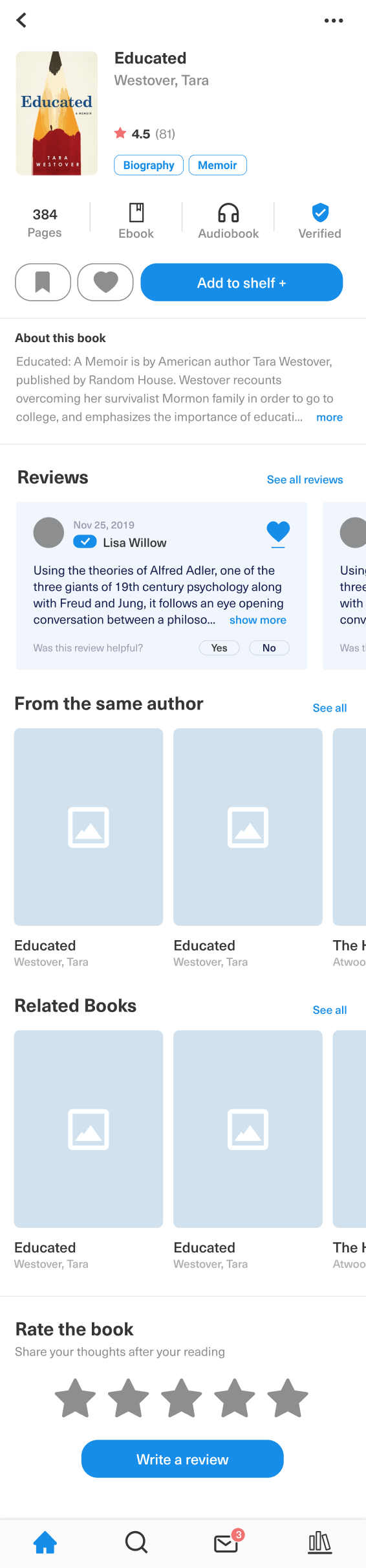
| Figure 14.3. New book details page design (v5). |
 |
| Figure 14.4A. New profile page design (v5). |
 |
| Figure 14.4B. New profile page spacing fix progress. |
 |
| Figure 14.5. Settings page. |
The link to the final Figma prototype is provided below:
Finally, the following is the final application walkthrough of Shelves:
* LATEST UPDATES *
Over the course of the continuation for refinement and development, the app's final concept is published and presented on my Behance portfolio in the following link:
Comments
Post a Comment