
26/08/19 - 16/09/19 (Week 1-Week 5)
Piyaphon Inthavong (0337589)
Advanced Typography
Exercises
LECTURE NOTES
Week 1: BriefingAugust 26th, 2019
The first class of advanced typography began with a surprise, Mr. Vinod announced the new way of lecturing, and that is for each of us in groups to prepare a lecture on particular topics for the class every week. The best way to learn is to teach, he said. Mr. Vinod then briefed as through the module information booklet and stated clearly to the class the importance of having a completed ePortfolio for the final grade.
Today's topic was Typographic systems. There is a total of 8 systems consisting of Axial, Bilateral, Radial, Dilatational, Grid, Modular, Random, and Transitional. As the first group, I was given the topic of Axial and Radial system to work on and present with my group.
Below is the compiled presentation of the 8 typographic systems from different groups.
Week 4:
September 16th, 2019
Today is a holiday; We continued our exercises online.
Week 5:
September 23rd, 2019
Applying Contrast
Gestalt Principles
1. Proximity (closer objects are grouped)
2. Similarity
3. Closure (see complete picture without having it complete)
4. Continuation
5. Figure/Ground
6. Pragnanz
Creating a layout
- Spacing (unvarying- no variety, uniform line spacing; varying- different line spacing)
- Grid (give organization)
- Balance
- Bullets and number list
- Figures, tables and illustrations
Creating Visual Hierarchy
- Grid (give organization)
- Balance
- Bullets and number list
- Figures, tables and illustrations
Creating Visual Hierarchy
- Size (generally people read big text first)
- Typeface weight and pairing (choose proper font to fit situation)
- Color and tint (bright colors are more likely to contrast than dark ones)
- Space and text (more space around element attracts the eye towards them)
- Composition (invisible elements
- Leading lines (our eyes naturally moves from the top left to bottom right)
- Diagonal lines (create depth and perspective)
- S-shaped (leads a fluid sense of movement to a composition)
- Z-shaped (structured sense of movement to a composition)
Here's the presentation slides of today's lecture:
INSTRUCTIONS
EXERCISES
Week 1:August 26th, 2019
As the first exercise, we were instructed to design 2 different layouts for each of the 8 typographic systems with minimal use of non objective elements. The art board size is restricted to 200 x 200 mm and the color usage is limited to three (that includes black and white). The given event details are as the following:
The Design School,
Taylor’s University
All ripped up: Punk Influences on Design
or
The ABCs of: The Bauhaus and Design Theory
Open Public Lectures:
November 24, 2019
Lew Pik Svonn, 9AM-10AM
Ezrena Mohd., 10AM-11AM
Suzy Sulaiman, 11AM-12PM
November 25, 2019
Muthu Neduraman, 9AM-10AM
Fahmi Reza, 10AM-11AM
Fahmi Fadzil, 11AM-12PM
Lecture Theatre 12
 |
| Figure 1.1. The first few sketches on the typographic systems. |
 |
| Figure 1.2. Continuation of sketches on bilateral and transitional systems. |
 |
| Figure 1.3. Scanned version of the final sketches. |
 |
| Figure 1.4. Digital draft on Axial system. |
 |
| Figure 1.5. Digital draft on Radial system. |
 |
| Figure 1.6. Digital draft on the Random system. |
 |
| Figure 1.7. Digital draft of Dilatational system. |
| Figure 1.8. Digital draft of Transitional system. The paths are drawn with the pen tool, these are meant for text to be placed along them. |
 |
| Figure 1.9. The grids and guide feature 8x8 was used for the Grid system layout. |
 |
| Figure 1.10. Final digital draft on the 8 typographic systems (before receiving feedback). |
After showing the work to Mr. Vinod and Mr. Shamsul, they suggested changes in some of the layouts and pointed out a few mistakes for me to fix. Their feedback leads to these final modifications as below:
 |
| Figure 1.11. Final outcome: Axial system. |
 |
| Figure 1.12. Final outcome: Radial system. |
 |
| Figure 1.13. Final outcome: Dilatational system. |
 |
| Figure 1.14. Final outcome: Modular system. |
 |
| Figure 1.15. Final outcome: Random system. |
 |
| Figure 1.16. Final outcome: Transitional system. |
 |
| Figure 1.17. Final outcome: Grid system. |
 |
| Figure 1.18. Final outcome: Bilateral system. |
Embedded PDF of the 16 typographic systems in spreads.
September 2nd, 2019
man-made objects (chair, glass, etc.), structures (buildings), and nature (Human, landscape, leaf, plant, bush, clouds, hill, river, etc).
We will then have to analyze and dissect the composition to find type within that image. While letterforms have been identified, we were to digitize and refine the letters into a readable typeface of its distinctive characters.
 |
| Figure 2.1. An image of the surface of a swimming pool water. I have chosen this image for the first part of exercise 2, Finding Type. |
 |
| Figure 2.2. Analyzing letterforms. I have manually traced the lighter part of the water with the pen tool in Adobe Illustrator. |
 |
| Figure 2.3. Dissected version of the pool surface in vector (without background). |
 |
| Figure 2.4. Final extracted letterforms within the fully traced vector. |
 |
| Figure 2.5a. Extracted letter "A." |
 |
| Figure 2.5b. Extracted letter "A" (isolated). |
 |
| Figure 2.6a. Extracted letter "N." |
 |
| Figure 2.6b. Extracted letter "N" (isolated). |
 |
| Figure 2.7a. Extracted letter "S." |
 |
| Figure 2.7b. Extracted letter "S" (isolated) |
 |
| Figure 2.8a. Extracted letter "X." |
 |
| Figure 2.8b. Extracted "X" (isolated). |
 |
| Figure 2.9a. Extracted letter "Y." |
 |
| Figure 2.9b. Extracted letter "Y" (isolated). |
Week 3:
September 9th, 2019 |
| Figure 3.1. Setting up guides and placing the extracted letterforms with the typeface Univers Std Light Condensed. |
After laying out the letterforms with the chosen font, my first aim was to position into the right place and angle without deforming their characteristics. I've achieved this step through the following processes:
 |
| Figure 3.2a. Warp, Arc effect. |
 |
| Figure 3.2b. Free distort effect. |
 |
| Figure 3.3. Getting the type into a right position. |
 |
| Figure 3.4. The puppet tool. This is the next step following along its right positioning. This effect can be damaging to the vector so I carefully planned out the way I would warp the type. |
 |
| Figure 3.5. Results after warping the type with the Puppet tool. |
 |
| Figure 3.6. Comparing the type to the image side by side to get the most similar results to the real image as much as possible. |
 |
| Figure 3.7. Manually refined version 1. A huge combination of tools such as the Direct Selection tool, Pen tool, Puppet tool, Smooth tool, Warp tool, and a few more was used during this process to get the letters in a wanted shape. |
 |
| Figure 3.8. Manual refine version 2. To replicate the style and consistency of the letter "A" was my aim during this process since it features the best characteristics among all. |
 |
| Figure 3.9. Comparison between the final work (top) and the originally extracted letterforms (bottom). |
 |
| Figure 3.10. Final letter "S" |
 |
| Figure 3.1. Final letter "N" |
 |
| Figure 3.12. Final letter "Y" |
 |
| Figure 3.13. Final letter "X" |
 |
| Figure 3.14. Final letter "A" |
--
Embedded PDF of the Finding Type exercise.
Week 4: Type & Image
September 9th, 2019I started this exercise with a quick draft in my mind. I immediately looked for a suitable image of a basketball player on the Internet, a figure that will represent the phrase I prepared, "Take the shot." Not too much PNG files were available so I decided to use the image below.
 |
| Figure 4.1a. The original PNG of the basketball player found online. |
 |
| Figure 4.1b. Edited saturation (in Photoshop) of the basketball player in attempt to compliment the color of the background. |
 |
| Figure 4.2. Compilation of my first attempt. |
On my first attempt, I arranged the images together and chose a background color that I thought would compliment with the basketball player. I then placed the text in a direction that I thought is easy for people to read, that is the vertical direction; By giving visual hierarchy to this composition, the word "take" and "shot" was my main priority so I increased their point size big enough for people to read them first, but "take" is the biggest in size. The next phase was applying the warp effect to the type; The main idea behind this effect was so that it would look like the crowds/team screaming "Take the shot" which is one of the common phrases in basketball.
After seeing the results, I wasn't satisfied as I did not understand the exercise properly. Mostly confused about the interplay between the text and image, I decided to redo the entire work in a new form of composition.
 |
| Figure 4.3. A second attempt on the exercise. |
 |
| Figure 4.4. Experimenting with a condensed typeface (spoiler: it didn't work). |
 |
| Figure 4.5. More variation of type forms and different layouts on the composition. |
Week 5: Type & Image
September 23rd, 2019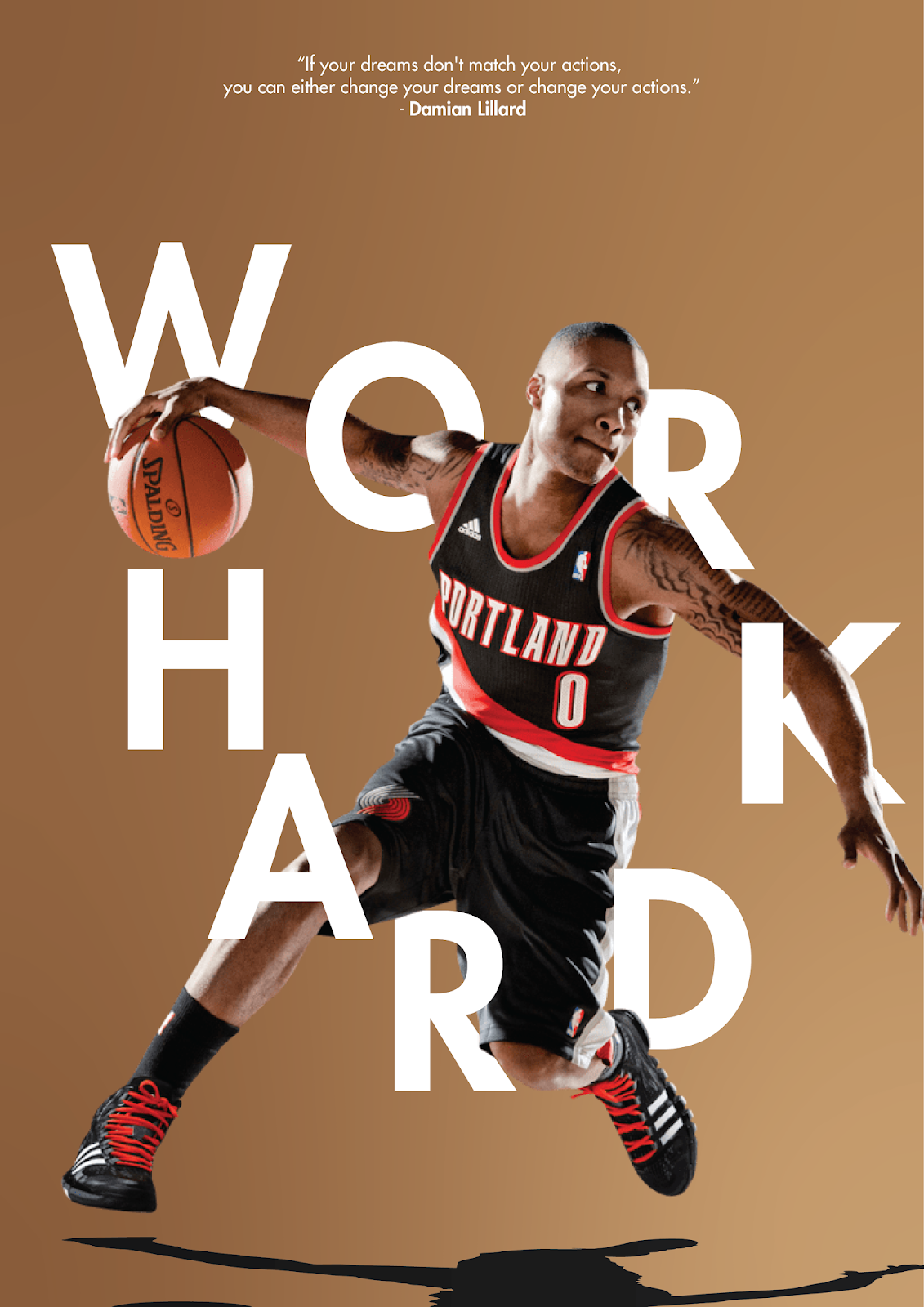 |
| Figure 5.1. First big progress from this exercise. |
After spending some time to think about the positioning of type, experiment with a variety of background colors, I finally found the optimal color for this composition, a gradient of light and dark brown-gold. I wrapped the type around different parts of the body and arranged them in a direction where the "work" can be quickly read without much effort; The placement of "hard" was to represent the movement of a basketball where the type falls from upper left and bounces up to the right. A quick shadow was then added to give the image less of a flat composition. Finally, to balance the visual weight, I added texts on the top part of the artboard (a quote from Lillard, the basketball player in the image).
 |
| Figure 5.2. An improved version of the shadow was produced after given a few feedback from my classmates. "The shadow is distracting" was the common feedback among them. |
After receiving a helpful feedback from Mr. Vinod, I made more changes to the design. The figure size was reduced to give the design some room to breath (the previous was too packed); The flow created from the figure was enough for the design, "there was no need to create more with the type." Mr. Vinod suggested using a grid system for the type to balance the design.
 |
| Figure 5.3. A grid layout version. |
 |
| Figure 5.4. Arranged the letters vertically, a more natural way of reading. Spacing between words was also maintained. |
 |
| Figure 5.5. Motion blur type creates a movement in the design, a momentum that interplay with the action of the basketball player. |
Embedded PDF of project 2: Type & Image
FEEDBACK
Week 1:August 26th, 2019
There are no feedback today.
Week 2:
September 2nd, 2019
General feedback
To apply what we’ve learned from semester 1 is essential to Advance Typography class, this means to automatically take care of the letter and kerning properly and use the right point size for body text (8-12pts. for print). Mr. Vinod reminded everyone to use the grid and guides feature in Indesign to align contents correctly to the composition, this is especially for the grid and modular system. Point size of numbers and capital letters (such as AM, PM) can be reduced 0.5 pt. lower than the rest of the body text to balance the appearance of the entire text as a whole.
Specific feedback
The non-objective element of my Axial system layout is not inlined with the content. One of the Radial system layout title is facing an incorrect direction. The Grid system is not exactly aligned to a real grid, but other than that, everything is fine. Mr.Vinod liked the flowing of the non-objective element in my Transitional system layout because it is smooth for the eye flow. Lastly, the modular system requires the most fixing due to some misunderstanding to the system.
Week 3:
September 9th, 2019
General feedback
It is relevant to scan through the senior’s blog, learn from their processes and examples. Make sure to capture the characteristics of the extracted letterforms. Even though our assignments can be completed in an hour or two, the marks are, however, reflected upon the efforts we invest in, learning is more important than grades.
Specific feedback
The consistency of the letterforms is lacking its feature. Other than everything else, the letter “A” captured the best character of the water element, its consistency is also best maintained among all. Try to capture the characters for all the letterforms as letter A.
Week 4:
September 16th, 2019
Specific feedback
Presently they are rudimentary and basic in nature. The interplay between the words and text aren’t dynamic enough and do not really enhance each other. You need to keep at it.
Week 5:
September 23rd, 2019
Specific feedback
The first part of the exercise (finding letterforms) is excellent, the letters are now consistent in style. For the second part of the exercise, Mr. Vinod have told me to compose the elements in a more rigid form, the letters are placed in a movement where it is not working, he suggested to oppose the movements/flow created by the basketball figure. After fixing what's been told, I figured out that the layout and composition is way better than the first try, however, Mr. Vinod told me that the reading direction of the letters are not natural to human eyes, arrange the letters vertically and balance the space between each words. Lastly, add more interplay and dynamic into the text and the image, try applying some motion effect to the type to match with the action of the basketball player.
REFLECTION
Experiences
Week 1: It was new to change from being lectured in the beginning of the class into us preparing the lecture to teach the rest of the class. I feel a little pressured in the beginning, but I realize how effective it is for us to feel that pressure to push ourselves into learning the given topic in order to give a good lecture to our classmates. The Q&A was my favorite part of the new way of teaching as it clears out most of the doubts we often get during the lecturing session.Week 2: The class today picked up right away from the previous session, there was no lecture today, and both the lecturers focused on giving helpful feedback to the entire class. The use of time seems efficient and gives the chance for everyone to pick up the pace of the exercise. All in all, it was fun, stress-less for me to work on my design.
Week 3: The given assignments are no longer a bother to me. The class feels more productive when enough time is provided for us to work on our tasks. Things become less complicated as we know what to do.
Week 4: There were no class today.
Week 5: Advance Typography gradually turns from stress into fun, things slowly make more sense when enough time is invested into the given exercises.
Observation
Week 1: Most of the people were unready for the new way of teaching. Some people were not coordinating or contributing as much for the research in the team, causing the lecture to feel incomplete.Week 2: I've found out as a designer that I like to make use of the negative space as a big part of the balance in almost all composition and that most of my layouts aren’t too messy. I am quite simple when it comes to laying out design composition.
Week 3: I’ve noticed the improvements I had since day 1 of Typography; A rewarding feeling which pushes me to give in effort into the work more than I usually do. It was as Mr. Vinod said, “Don’t focus on grades, focus on your learning.”
Week 4: There were no class today.
Week 5: Lectures given by students may be hard to pick up at certain points, this may be the cause of the way some of the words are delivered, but the lecture feels more friendly in this way of teaching.
Findings
Week 1: Time was not enough for most of us. This made a great impact on the slides for our lecture, some of the groups had awesome slides but were unprepared for the lecture, hence causing most people to not understand what they were trying to explain on their topic. Most of the questions were covered during the Q&A sessions.Week 2: It is not the best thing to not make use of negative space efficiently. I often leave the white space blank mainly because I don’t want my design to be complicated, which causes me to become unimaginative at most times. I often favor the Bilateral system layout because it is one of the cleanest for me, and during the exercise, I struggled to come up with a decent layout when it comes to Dilatational, Modular, Transitional, and random design. Perhaps, I may have to learn to let loose in my design more.
Week 3: Everything became easier, challenges that I once had a hard time coping with is now an enjoyable task. The more we practice and push ourselves, the more comfortable we feel within that subject, in this case, advanced typography. It is not as bad as we think after all.
Week 4: There were no class today.
Week 5: After receiving enough feedback from Mr. Vinod today, I've put my thoughts together and have learned to do self check, evaluation based on factors such as functionality of design (typeface, purpose, visual balance, and more such as asking myself if the design is easily readable or understandable in a sense) and the aesthetic of design.
FURTHER READING
 |
| Typographic System, book by Kimberly Elam. |
It was the first day of class as both our lecturers briefed us through our first topic, the eight typographic systems, and handed us the PDF version of the book to read through quickly. This book talks in-depth about those systems. With a limited amount of time to present the given topics, I quickly skimmed through the book and grasped the overall idea of all the different layouts.
Below, are the definition of the 8 typographic systems referred by the book:
Axial system: Design to the left or right of a single axis.
Radial system: Design from a central point of focus.
Dilatational system: Design along a circular path.
Random system: Spontaneous design.
Grid system: Design with vertical and horizontal divisions.
Transitional system: Design with shifted bands and layers.
Modular system: Design with standardized units.
Bilateral system: Design that is symmetrical to an axis.
As simple as the layouts may seem, all of the eight different systems require certain procedures to make the most out of them. The procedures often include the Initial phase, Intermediate phase, and Advanced phase. Although the different systems require us to go through the same phases, the procedures vary remarkably through each stage.
 |
| TYPOGRAPHY, book by Ambrose / Harris |
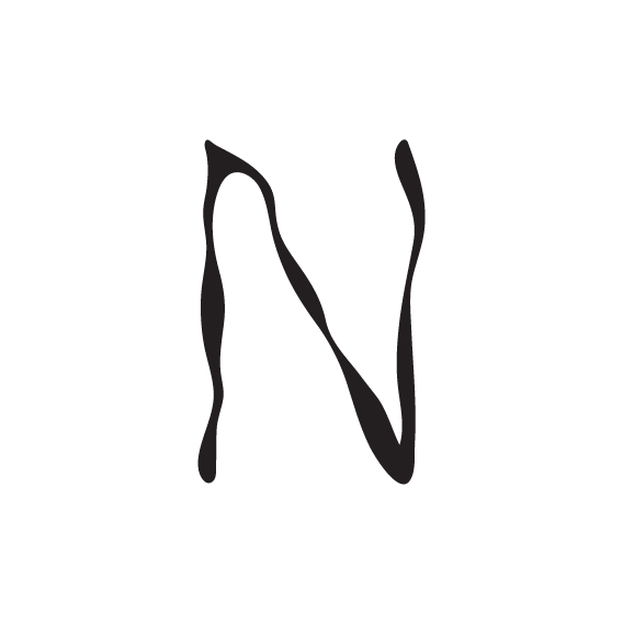
N. the arrangement, style and appearance of type and typefaces.
Since we’ve been through the basic part of typography, I’ve decided that I read into the parts that will support me on the current exercise, that is mostly references for Type and Image.
In the example below, the image features hand-drawn type with lines that follows the shape of the face. This provides a personal message and characteristics that is about or related to the women in the picture.

This example is a poster about bringing together print and weave to reflect the theme of the exhibition. The cool thing about this is how the type was sewn on to the poster before it was sent to print.
